
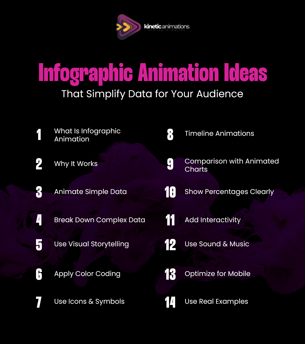
Numbers, stats, and graphs tend to befuddle many people. However, imagine making the data comprehensible, even entertaining. The key to doing so lies in Infographic Animation and the smart use of visuals.
The process involves transforming data into engaging visual narratives. Rather than presenting dull numbers in text format, you utilize animated images that captivate people’s attention. Infographic Animation enables you to convey information quickly and highlight infographic video benefits for your audience.
Running a startup or managing a small business, as well as creating content in the USA, requires flawless communication. People are too busy for lengthy reading. Therefore, it is important to present information visually. In this article, we discuss several easy-to-implement infographic animation concepts for effective content creation.
Why Infographic Animation Works So Well
It is true that we find images easier to comprehend than words. The comprehension of information through animation is done three times as fast compared to using other methods. This is because of the attention-grabbing nature of animations. Complex ideas become simpler through animations.
When was the last time you viewed an exciting spreadsheet or an animated graphic? In which one would you say you comprehended everything? Animations make it easy to comprehend ideas presented in numeric forms.
The advantages of infographic videos in business are quite enormous, especially for businesses operating in the USA market. Language differences can present problems, but not when using animation in your presentation. These are some of the biggest infographic video benefits for modern businesses.
Simple Data Comes Alive with Movement
Sometimes, the data that you have may already be straightforward; however, when presented in a document, it might seem boring. Using animation can help bring the information to life. Slow counting can spark excitement in the numbers that you are presenting. Gradual bar growth shows the progress that your data is making in a realistic manner.
If you are trying to show a rise in sales numbers, for instance, you do not just present those numbers. Instead, use a graph where the trend line moves upward steadily. Incorporate changing colors depending on the rising figures. Your viewers will see the increase right before their very eyes.
Here are some practical data animation tips for you. Begin with straightforward data and then animate it slightly. You do not necessarily have to get overly complicated.
Breaking Down Complex Information Step by Step
How will you cope when your data becomes too complex for simple infographics? Perhaps there are various statistics, different categories, or several layers involved in your data. This is where a kinetic animations infographic can be very helpful for you.
The key here lies in breaking down everything into smaller parts. Present data in small chunks rather than all at once. Let your audience grasp one chunk before introducing another one. Make use of animation to slowly unfold information.
Think about making an explanation of a company report that includes five different statistics. Rather than presenting all five of them together at once, you present them one by one, for instance, starting from one statistic, then pausing, and adding another one.
Using Visual Metaphors That Everyone Understands
It may not always be helpful to simply look at numbers without putting them into context. Visual storytelling data will be most effective if metaphors are used that are already known to your audience.
Instead of telling someone ” we have saved 1000 hours,” use an image of a clock with the hands whirling around. Or, rather than explaining a 50% increase by giving a percentage figure, display an image of a seedling growing into a mature plant.
In the context of the USA market, consider your target audience and what images they can relate to. For example, a cup of coffee for morning productivity, and a busy marketplace for customer traffic.
Color Coding Makes Data Crystal Clear
Colors are a very effective way to use in infographic animations. Various colors can distinguish different categories, emphasize important aspects, or illustrate any development. However, do not overdo it. Too many colors may confuse you.
Select two or three colors for your infographic animation. Use one color to represent positive statistics, such as success or positive change. Apply the second color to illustrate negative statistics such as failures or problems. The third color will be for background information.
As soon as there is an incremental change in colors in your infographic animation, everyone understands what is going on. Transitioning from red to green shows improvement. An incremental increase in blue shows significance. This technique works especially well with animated charts to improve clarity.
Icons and Symbols Speed Up Understanding
Words make people slower. Icons make people faster. By removing words from your infographic animation and replacing them with icons, people will understand your message immediately.
Use an icon of a person to represent customers. Use an icon of money to represent money. Use an icon of a clock to represent time. These icons are universal in their meaning, making them ideal for a multicultural environment such as the USA.
Animate your icons to convey relationships and changes. An icon approaching another icon represents association. Icons multiplying themselves represent growth. Fading icons represent diminution. This is a key part of visual storytelling data strategies.
Timeline Animations Tell Stories Over Time
For instance, when your data is temporal in nature, timeline animation would be the ideal solution to choose. These animations enable you to illustrate how some data points developed over time or what will happen in the future based on the present and the past.
All you have to do is create a timeline using a straight line to represent time and add the required events to it in order to trigger an animation. This method is effective in highlighting trends, patterns, and relationships.
For business organizations like startups operating in the USA, the use of timeline animations to explain history is quite appropriate. Timeline-based animated charts help show trends more clearly.
Comparison Animations Show Differences Clearly
At times, you will have to analyze two or more objects. Animation tools enable you to create a side-by-side comparison where you put the options side by side and identify their uniqueness.
Animated charts like bar graphs and pie charts help you to compare different prices, features, or performances. In this case, you will animate bars that increase at varying levels. The same applies to pie graphs that are divided into unequal sections.
The technique is applicable when e-commerce and SaaS firms showcase product comparisons and different pricing models. Your consumers can make an easy decision once they view all options side by side.
Percentage and Proportion Animations
People have a hard time comprehending percentages and proportions. However, animating them will make them very easy to comprehend. The gradual filling of pie charts, circle segmentation, or the filling of liquids within containers makes percentages easily understandable.
Demonstrate how individual parts combine to create a whole number. Illustrate individual parts combining to make a total of 100%, or one part increasing while the other decreases to illustrate proportional change. This is one of the key infographic video benefits that will enable people to understand the relationship between numbers without having to calculate anything.
Marketing managers presenting their campaign outcomes and business owners illustrating their budgets would find these percentage animations interesting to watch.
Interactive Elements Keep Viewers Engaged
Although interaction is not required for all types of infographic animations, the inclusion of some interactive features can help engage users. Hover effects that provide additional details. Click functions that display various data perspectives. Such components transform passive observers into active users.
In digital presentations or websites, interactive infographic animation allows users to take charge. They can focus on the data that matters to them. It creates a more personalized and valuable experience.
Interactive elements can be included by content creators or YouTubers in their videos’ descriptions or supplementary resources.
Sound and Music Enhance the Experience
Do not overlook the use of audio elements. An appropriate background score or sound effects will enhance the animation process of your infographic presentation. A soft “ping” sound effect when new data emerges. A lively tune is used when presenting a positive growth trend. Such audio elements will direct viewers’ attention to relevant parts of the infographic.
Make sure to avoid complex sounds and ensure that they do not overpower your visual presentation. Professional animation firms know the perfect balance between the use of visuals and audio elements.
Mobile-Friendly Animations Reach More People
People in the USA use their phones to access content. The infographic animation needs to function without any glitches when viewed on a mobile device. This can be done by using large and clear images. The use of legible fonts should also be considered. Additionally, your animations should not experience glitches while playing on such devices.
It is important to test out your animations on various mobile screen sizes before uploading them. Ensure that your messages have been delivered in an appropriate manner. This will help you maximize your reach, among other things.
Real Examples Make Ideas Concrete
The abstract data is much more potent if it is used in conjunction with tangible examples. Provide true customer success stories. Present the real outcomes of the product in question. Incorporate real-life case studies in your infographic animation.
Don’t just tell them “80% satisfaction rate,” instead create an animated version of why customers felt satisfied by using their real photos, showing the feedback, or anything else that would make this statistic come alive for the audience. This strengthens your visual storytelling data approach.
When creating infographics animations for small or medium-sized businesses, providing a realistic example helps establish credibility.
Why Choose Kinetic Animations for Your Infographic Needs
Producing quality infographic animations necessitates not only imagination but also technical know-how. We at Kinetic Animations possess the ability to produce compelling stories using complicated data. Our animation team is skilled at creating kinetic animations infographic solutions that simplify any data into visually interesting stories.
At Kinetic Animations, we collaborate with USA organizations to comprehend the difficulties of interpreting their data. Whatever you want to show on your startups’ performance or even provide reports on your business through social media, we have the knowledge to help you bring out the best in your data. From initial concept creation to delivering high-quality animation videos, we can do it all.
Are you tired of using static data for presentations and business reports? Take a look at our animation portfolio to see how we’ve assisted other companies in simplifying their storytelling process.
Conclusion
Infographic Animation is the answer to bringing your complicated data to life. Be it for an explanation of the progress your startup made, reports for your small business, or educating your content consumers, all of it becomes easier when it comes to animated visuals.
In order to achieve success, one has to stick to simplicity. Employ smooth animations, color codes that speak to your viewers, recognizable icons, and reveal everything bit by bit. Stick to visual storytelling data that will connect emotionally as well as logically with your viewers. One should not forget that effective animation does not necessarily have to be elaborate.
If you feel like you are finally ready to create an infographic animation for your audience in the USA, visit Kinetic Animations infographic services. We are happy to assist you in bringing your data to life. Do not let boring presentations get in the way. Get your free quote now.